It's the fourth day into the stock count and there's no news about discovering any snakes or other creatures in the company. I was relief and keeping my fingers crossed for the rest of the stock count. I wouldn't wanna stumble on a snake or something in the parking lot.
I'm a proponent of minimalism in Web site design. Unless it's a Web portal such as Yahoo! or E-commerce sites such as Amazon or eBay, i think the design should be kept clean and uncluttered as much as possible. It's even more so for those that are meant for reading (e.g. a blog) because the main purpose is for people to read the text; to make the reading as easy as possible should be the aim of the design.
Precisely because of this belief, i spent quite some time looking for a blog design that i would consider simple and serve its main purpose. I don't fancy those designs that enclose the main text in a box because it shows very little text per screen with a lot of unused spaces and hence makes reading difficult. As such, it was rather hard to find a design that suits what i want because most of the designs (even those standard ones provided by Blogger) box-up the text.
I feel that the current design i'm using conforms to the idea of minimalism while still not too bad aesthetically. However, i've unintentionally violated one of the Web site usability guidelines -- i didn't cater for cross-browsers!
 When i was doing up the template, i tested it only with IE, forgetting that other browsers may render my Web pages differently.
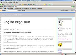
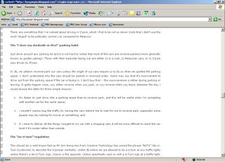
This is how my site looks with IE 6.0:


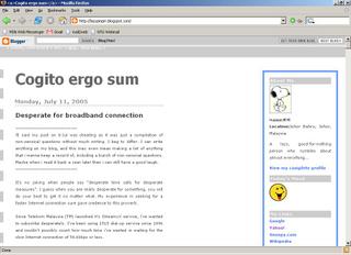
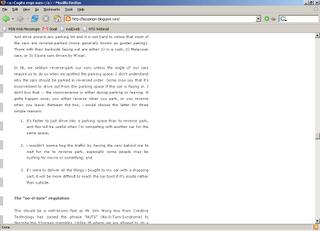
and this is how it looks with Firefox 1.0.4:


Based on the Web counter that i've put on my site recently, there are quite a number of Firefox users reading my blog.

They must be thinking how my design sucks! Oh dear, i gotta spend time fixing it, or maybe change the design all together. With my habit of procrastination, i hope i can get to it soon...
Labels: blogging
